
NBC App - America’s Got Talent

The Highlights
Enhanced voting experience for AGT fans
→ Designed a seamless in-app voting system, making participation more intuitive and engaging.
Optimized live content interaction
→ Improved user flows for engaging with real-time AGT events, boosting audience retention.
Refined UI for accessibility & scalability
→ Standardized interactive elements for a more inclusive and consistent multi-platform experience.
The Challenge
Design Improvements


The Process
I had to review the existing AGT app and propose enhancements for Season 17. It was not necessary to create any comps.

To discover how AGT’s features stack up to similar voting apps:
First, I deconstructed the AGT app and three of its closest competitors.
Then, I brainstormed solutions to improve the America’s Got Talent app.
Competitor #1: The Voice

Competitor #2: American Idol


Competitor #3: Love Island
After deconstructing the competition’s apps, I started to address the things to consider.
Things to Consider
What features in the Voice aren't included in the latest AGT app?
What features appear in competitor apps that could apply to AGT?
Are there any areas for improvement in terms of accessibility?
How can we drive more video clip plays within the AGT app?
How can we add more moments of delight for the users?
Can we improve any transitions / animations?
How much of a design and/or dev lift will this require?
Are there any features in the backlog or older wish lists that we can resurface?

America’s Got Talent

Structuring the Competitive Analysis
Besides the other NBC show, The Voice, I noticed that AGT’s competitors used the standard iOS menu layout for iOS devices. I knew the ‘hamburger menu’ is more commonly used for Android apps but not for iOS.
Since all my screenshots were from an iOS device and iOS menus tend to be more straightforward, I started to reorganize all the categories from the existing hamburger menu.

For comparison consistency and to help simplify the menu, I opted to build around the standard iOS mobile structure. Typically, this structure can hold up to five icon categories on the main menu bar.
I reorganized the existing app content to fit five main buckets. The idea was to group content with a similar theme under a mutual umbrella title. This is how I came up with the five titles below: Home, Videos, Vote, Talent & Audition.

The Solution
Sharing initial suggestions for design improvement
After considering all the current AGT features and card sorting the existing content categories, I revisited the ‘Things to Consider’ table.
I started to make the findings more presentable to share with other members of the design team and the Product Manager. I also considered more incremental improvement opportunities such as close captioning and warning prompts.
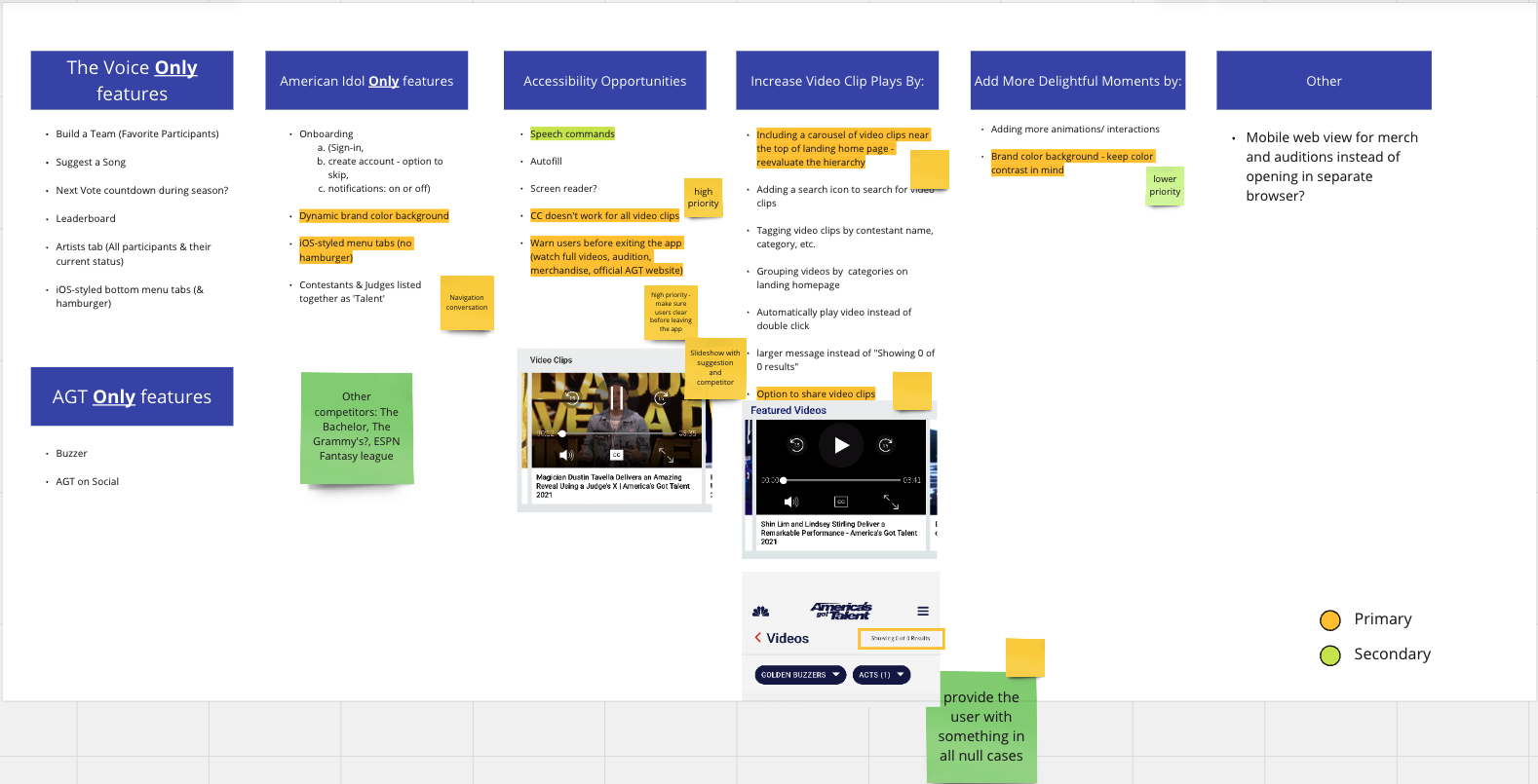
Then, I sorted the ‘Primary’ suggestions into ‘High Priority’ and ‘Lower Priority’ categories.

For the improvements considered ‘High Priority’, I presented visual examples to help convey the goal in a clearer way.


The Impact
Due to budget and development constraints, I could not implement all the new findings. I shared these findings with the Product Manager. The quick wins were implemented, including a more reliable and consistent close captioning for featured video clips and giving users a ‘no results’ message instead of a ‘Showing 0 of 0 Results’.
I am aware more research and user testing would have been needed to justify adding some of the other features. The change from hamburger (Android) to bottom (iOS) Navigation for the iPhone version of the app, grouping video content by category, and creating a more dynamic background would take more time to develop and implement. These findings were likely not part of the business goals at the time.
The next step would have been conducting A/B testing between the existing Android and suggested iOS navigation.
Company
NBCUniversal
My Deliverables
Competitive Analysis, User Flow
Timeline
3 Weeks
Tools
Miro, Photoshop, Sketch
Team
Uba: UX Designer
Micah: Partner Marketing Manager