
Best Buy
Retail App

Optimizing content engagement on the mobile app to encourage returning customers
I explored new opportunities to improve the Best Buy mobile app. We wanted to transform the current retail app from a strictly shopping experience to a daily use experience.
The Highlights
Optimized checkout & payment UX
→ Simplified navigation and purchase flows, reducing cart abandonment and increasing conversion potential.
Improved My Best Buy rewards integration
→ Enhanced visibility of membership perks, encouraging sign-ups and engagement.
Redesigned product discovery & filtering
→ Created a more intuitive browsing experience, helping users find products faster.
The Challenge
Make the app more helpful and guide customers to desired products
Information Overload
Users are overwhelmed with the amount of information presented to them.
Lack of Personalization
A survey revealed that anticipating customer needs was an area of improvement for the Best Buy app.
Unfulfilled Users
Cross-platform product research directs users away from the app.
The Process
Competitive Analysis
I decided to review a wide range of apps for this ambitious undertaking.
The pool consisted of apps that encouraged daily usage from the user.
-

Skillshare
Explore a library of different types of classes to get creative and try something new. Students can share projects they have worked on in their Skillshare classes. They can also like and comment on the work of others.
Goal: Promotes the feeling of productivity and intelligence.
Potential opportunity: Leverage the educational expertise we have at Best Buy. People should come to our app knowing they can learn something valuable in their research and trust that it is coming from an expert/ professional.
-
Public
The app allows investors to follow people and companies and view others’ portfolios. Users can gain insights and direct feedback before making investing decisions.
Goal: Broaden the audience of investors, make investing more social and attainable. Create a supportive environment where novice investors can learn from experts.
Potential opportunity: Remove the daunting task of understanding how to use and buy software and hardware for non-tech users (primarily the senior community).
-

Peloton
Access a library of live and recorded fitness classes. Users can engage in a range of challenges and view post-workout results.
Goal: Join a workout community from the comfort of your own home. Experience instruction from experts trainers.
Potential opportunity: Like Peloton, Best Buy could create a unique community that users would want to join. Best Buy has many technology experts who can provide a one of a kind experience. Buyers will be able to engage with the best and most knowledgeable.
-

TikTok
Users share short one-minute clips privately with friends or publicly to an explore page. They can scroll through personalized content based on their viewing activity and preferences by liking, commenting, and sharing.
Goal: Easily create and bring creativity in the form of short one-minute videos.
Potential opportunity: TikTok’s ‘For You’ feed becomes extremely tailored to the user's preference the more they use it. The algorithm keeps the user engaged with personalization. Best Buy could use this approach to present products to buyers.
-

NextDoor
View relevant news from your neighbors and surrounding businesses. Users can join groups, buy and sell items, list services, and research local businesses.
Goal: Promote safe community engagement and stay aware of the happenings in your neighborhood
Potential opportunity: Proximity is the key for NextDoor. Best Buy could adopt this focus by connecting shoppers with local Best Buy experts to maximize the existing presence of physical Best Buy stores.
-

Depop
A second-hand thrifting experience. Users can buy and sell merchandise, follow people and shops, and explore new pieces worldwide.
Goal: Makes second-hand shopping a social community-building experience.
Potential opportunity: Depop promotes socializing within their shopping experience. Like mall shopping with friends, buyers get to discuss their likes and discover new trends. Best Buy could adopt the ‘word of mouth’ browsing that only friends and family can provide.
-
Etsy
Shop owners create pages to post their goods. Users can follow shops, search, save items, and browse recommendations. Saved items give more personalized recommendations.
Goal: Personalize the shopping experience for handmade goods.
Potential opportunity: Etsy integrated Augmented Reality into its shopping experience. Best Buy also uses AR on its retail app to preview how something like a TV would look in a living room. This tech can be pushed further.
-

Mint
Gives personalized financial insights, creates custom budgets, tracks your spending, and monitors different subscriptions. Shows users their net worth and spending trends.
Goal: Allows users to be more informed about their personal finances with a holistic view of their financial accounts in one place.
Potential opportunity: The data feedback and personalized insights keep users coming back to Mint. Best Buy needs valuable information/ content to bring buyers back to the app daily.
Consensus
After reviewing these apps and their respective goals, I pulled aspects each app utilized that could work for Best Buy’s retail app.
Social/ Community
Customer empowerment
Shared discovery
Creativity
Data control
Transparency
Non-Retail Features
One-stop shop
Health
Video content
Education
Daily Use Tools
Augmented Reality
Personalized insights
Barcode scanner
Offline reference & use
Measurement
Activity tracking
Expert Notability
Easy access to subject experts
Exclusive knowledge
Sharing results with professionals
Personas
These were the three types of shoppers I decided to focus on. They each have very distinct backgrounds.
I made sure to include different levels of understanding of consumer technology.
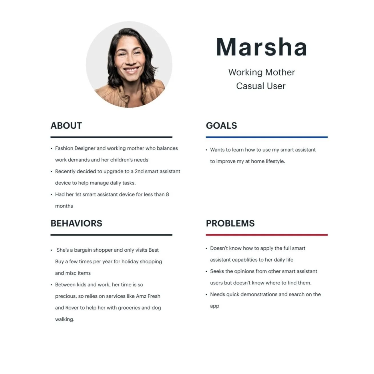
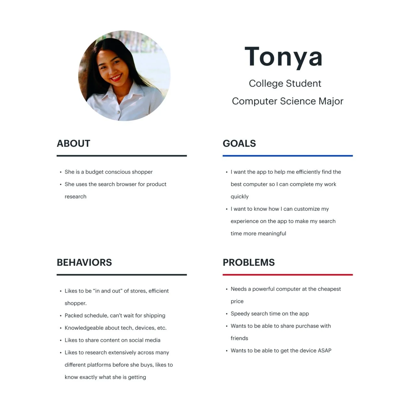

To build these personas, I utilized user information from Best Buy’s UX research team.
After speaking with a friend who lives with a disability, I considered potential usability hurdles in navigating the retail app. I reached out to a Best Buy accessibility research lead and a fellow UX designer who lives with a disability to learn of new technologies that could ease the navigation experience. I wanted to find ways to incorporate the emerging technology for accessibility navigation.
Information Architecture
I needed to reorganize the existing IA to incorporate the new features.
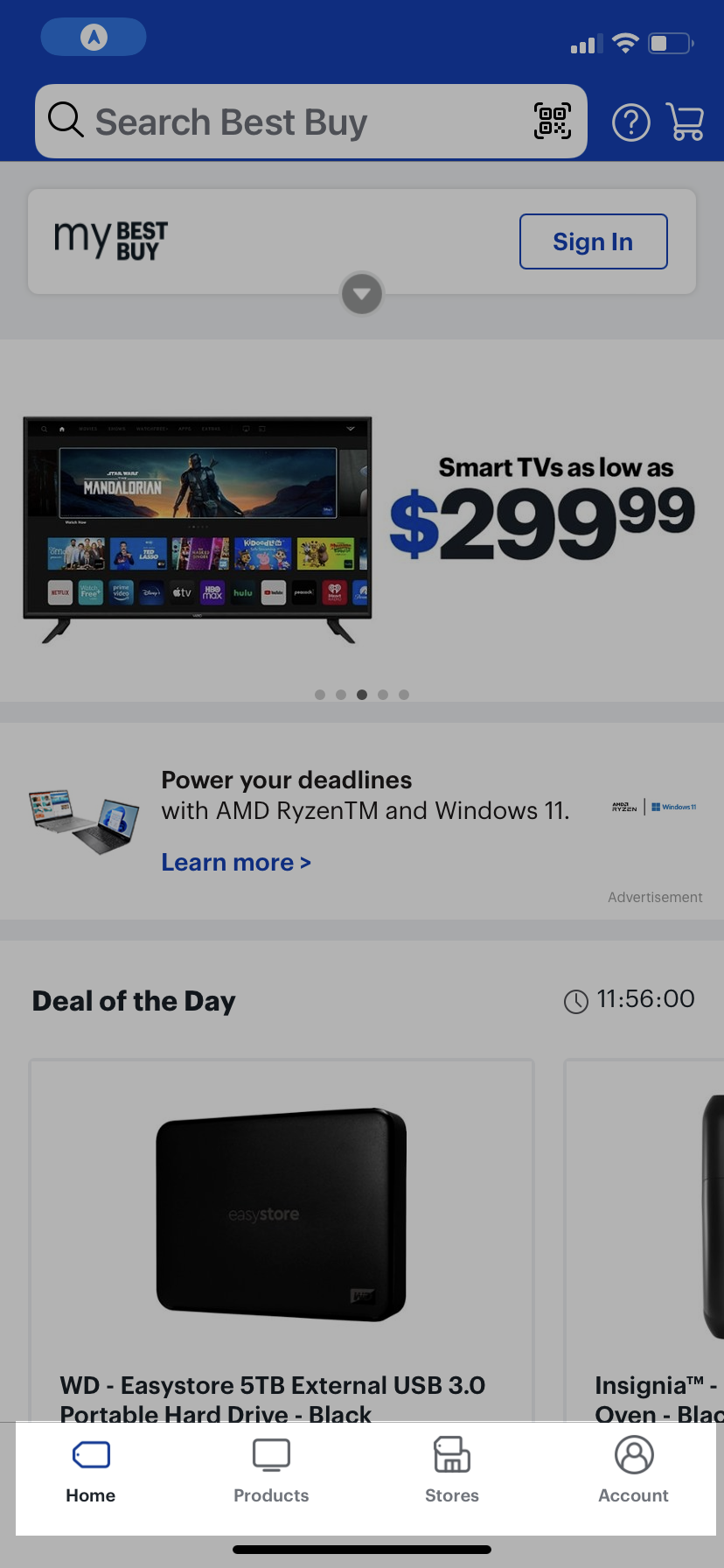
Existing Main Tabs
These 4 tabs (Home, Products, Stores & Account) represent the main menu for the Best Buy retail app.
Proposed Information Architecture

I sought to expand the existing tabs on the app.
The ‘Products’ tab would become the ‘Search’ tab where products, services & recently viewed items could be easily found. Also, a dedicated ‘Search’ tab would remove the need to have an always-present search bar throughout the app. Thus, freeing up valuable real estate on the screen and cleaning up the visual navigation for the user.
The ‘Account’ tab grew to include the user’s reviews and activity history as well as their preferences.
I removed the less relevant ‘Stores’ tab and added two more social-oriented tabs in its place.
The ‘Chat’ tab allowed the user to contact our tech experts, the Geek Squad, for questions and troubleshooting. Direct Messaging and Video Calling would allow users to reach out to other Best Buy members as they would on popular social media apps.
The ‘Share’ tab is where members can create and post content or comment. Best Buy product-related reviews, how to’s and unboxing videos would live on this tab.
User Journey Map
I detailed the casual user’s journey from product discovery to app exploration to final purchase.

The Solution
Wireframes
Onboarding
I decided to add an onboarding process to make up the removal of the ‘Stores’ tab and give Best Buy another opportunity to better understand its customers in a non-invasive and transparent way.
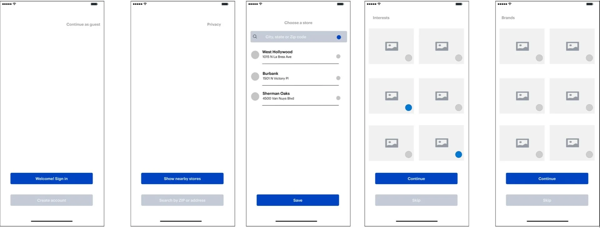
The key focus for this onboarding process was to give the user an option to customize their experience. The user could let the app know their interests and favorite activities. They also could let the app know what their favorite brands were.
In addition to making it a more favorable user experience, the option for brand selection gave Best Buy the ability to present items that fit the user’s brand affinity.
Search
The goal for this revamped search tab was to ease browsing for casual users.

The addition of a Product Scanner for barcodes could help to learn more about items quickly.
Recently Viewed items would be shown near the top in a horizontal scroll. Product categories would be listed with service categories below.
To help with accessibility, microphone capabilities would be added for voice recognition.
The search bar would be used to search for products and services provided by Best Buy. Reviews and other user generated content could also be searched in this bar.
Pre-selected Filters would help to narrow down search results.
The ‘Suggested Deals for you’ would populate based on the user’s search activity.
Share (User Generated Content)
The purpose of a user-generated content tab would be to encourage higher daily engagement from Best Buy customers.

UGC can promote social and informative reasons to stay on the app in-between purchases.
After the presentation of our first iteration at TechBlue, I decided that this UGC tab would work best as a ‘Share’ tab. A separate ‘Chat’ tab was spun out of this decision. The goal was to present a clear course of action to share content publicly while providing another path to chat with experts and members directly.
How will users know these features exist?
-
Email and app notifications will notify customers of the new features. The notifications will prompt the users to share content on the app after completing a purchase.
-
The ‘Chat’ function would be used to book service appointments. By integrating Geek Squad consulting appointments into the “Chat” function, users will become aware of this feature.
-
The exclusive content on the Best Buy app can drive external social media attention back towards the app.
Metrics of Success
Decreased Churn Rate
Fewer customers leaving the app. By being able to research products on the Best Buy app, they will stay engaged longer.
Increased Customer Activity
An increase in customer activity between the Chat and Share function. Best Buy will have a better understanding of the customer and their needs. The registered profiles will help us offer products and services to fulfill their goals.
Increased Customer Loyalty
More registered profiles, myBestBuy accounts, and Best Buy cardholders.
After crunching some numbers,
We hope to increase orders by at least 1% which equals 40,000 orders a quarter (or 120,000 annualized)
Annual Revenue
Prototype
The Impact
What made this project challenging were the limitless possibilities of making the Best Buy retail app a highly used app. Up to this point, apps with high user returns usually filled a daily want or need (ie. entertainment, food, finance, fitness). Apps with high engagement were usually of a more ‘social’ or educational nature.
Since the initial Best Buy app fit neither category, we had to get creative to incorporate these elements. By leaning into unique strengths that Best Buy already had (ie. Geek Squad and a specialized focus in consumer electronics) we were able to hone in on the shared knowledge opportunity for the app.
Ultimately, the app idea was well-received. We presented the early iteration of the concept at Best Buy’s company-wide event, TechBlue, where the CEO expressed intrigue. Later, we shared the next iteration as a part of our Seattle office-wide final presentation.
Company
Best Buy
My Deliverables
Competitive Analysis, Personas, Information Architecture, User Journey Map, Wireframing, Prototyping
Timeline
2 Months
Tools
Figma, Miro, Google Slides
Link
Best Buy App
Team
Uba: UX Designer
Samantha: Product Manager