
A UX audit and feature optimization to improve AGT’s in-app voting and live content engagement

The Problem: Outdated IA and limited accessibility hurt engagement on AGT’s app
What I did: Audited the app, benchmarked competitors, and proposed UX enhancements
What Changed: Closed captioning improved, error states clarified, and long-term roadmap seeded for future releases
Summary
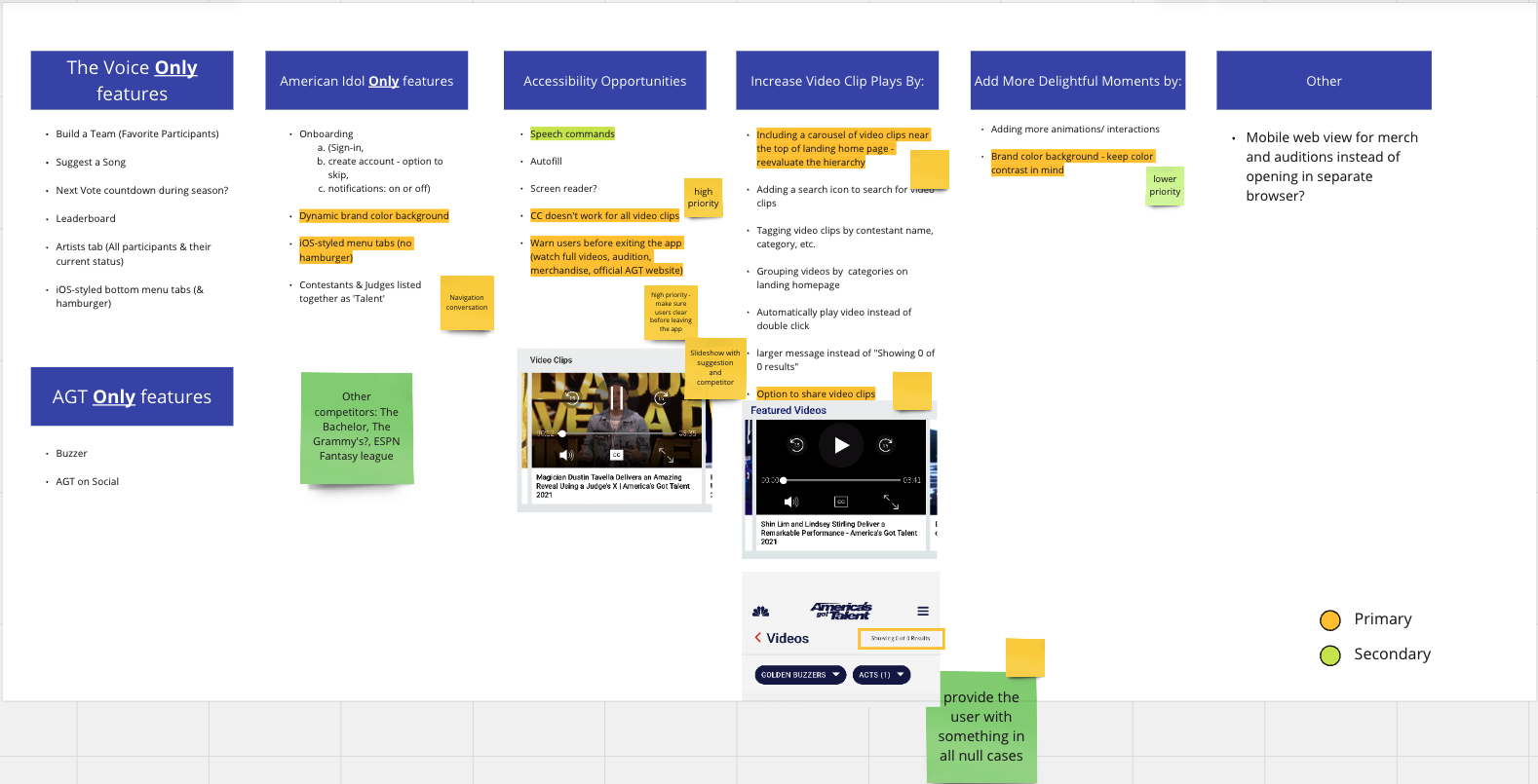
I explored new opportunities to improve the American Got Talent app. I wanted to consider the app features of its live TV show competitors while creating an optimal experience for the AGT audience.
My Deliverables
Competitive Analysis, User Flow
Role
UX Designer
Tools
Miro, Photoshop, Sketch
When
2021
Team
Myself
1 Partner Marketing Manager
1 Software Developer
🎯 The Challenge
NBCUniversal needed a UX review of the America’s Got Talent mobile app ahead of Season 17.
While the app supported voting and show content, the experience was inconsistent, especially on iOS devices.
Low visibility on how AGT compared to competitors in this space
Fragmented video content without clear categories
Outdated hamburger menu on iOS (more suited for Android)
Missed opportunities for delight and accessibility
NBC wanted a strategic lens on the experience, focused on how it could be improved without a full redesign and with minimal dev lift.


🔍 The Approach
Discovery
I started with a teardown of the AGT app alongside three competitors:
The Voice
American Idol
Love Island
This competitive audit focused on:
Navigation structure
Voting flows
Accessibility features
Moments of delight and interaction
Strategy
I created a list of “Things to Consider” based on app heuristics, platform conventions, and business context.
Could we align the iOS version to native standards (bottom nav)?
Were voting and video engagement too buried?
What content buckets could be better grouped?
How accessible was the current video content?
Execution
The app’s structure was mapped into five logical buckets:
Home
Videos
Vote
Talent
Audition
These categories were proposed to simplify navigation and align the iOS version to Apple UX guidelines. Quick wins were flagged for immediate impact, while other suggestions were marked as “stretch” opportunities.
🏗️ The Work
Discovery & Insights
Identified that AGT’s competitors all used tab bar navigation for iOS
Flagged inconsistent accessibility practices (e.g., missing closed captions)
Found user confusion when no search results were returned (“0 of 0” message)

Experience Mapping & IA
Reorganized the app’s hamburger menu into a 5-icon iOS tab bar system
Grouped similar content types under umbrella categories
Simplified navigation to reduce cognitive load and increase discoverability

Design Execution
Shared annotated recommendations and visual examples for UI enhancements
Focused on practical suggestions with low dev lift, such as:
Closed captioning for video content
Improved error states for search/no results
Consideration for adding subtle animation/motion enhancements
Tools used: Miro for mapping, Photoshop and Sketch for visual references
Iteration & Feedback
Partner Marketing Manager provided feedback on priority and feasibility
Shared findings with the product design team; prioritized by development effort


🚀 The Results
Implemented:
Improved closed captioning reliability
Better error messaging for search results
Standardized interaction patterns for key content flows
Deferred:
iOS-specific bottom nav redesign
Category-based video content organization
Enhanced visual design and animation tweaks
While not all suggestions were implemented due to dev constraints, the quick wins had an immediate impact on user experience. Longer-term recommendations were documented for future product cycles.
Testimony
“I brought on Uba on a 3 month contract to augment my UX team during a busy push. Uba was a consummate professional from the very first day.
He stepped in and learned all the NBC processes quickly and provided the UX design support the whole team needed.
Beyond just his skillset, he has a terrific attitude and was able to integrate with the team seamlessly. His empathy and soft skills are key to making him a strong UX designer.”

Coburn Hawk,
Director, User Experience & Design at NBCUniversal
Reflection
What I learned:
UX wins can come from restructuring, not reinventing
Platform-native behaviors matter—users expect different things on iOS vs. Android
Prioritization is key when working with constraints
What I’d do differently:
Push for quick user validation to support higher-effort proposals
Work closer with engineering earlier to better understand dev tradeoffs
Recommend A/B testing navigation changes for measurable insights